Watercolour or Gouache: Two Different Kinds of Opacity
Watercolour or gouache comes down to how you want light and layers to behave; choose a small painting experiment that makes each paint’s character clear.
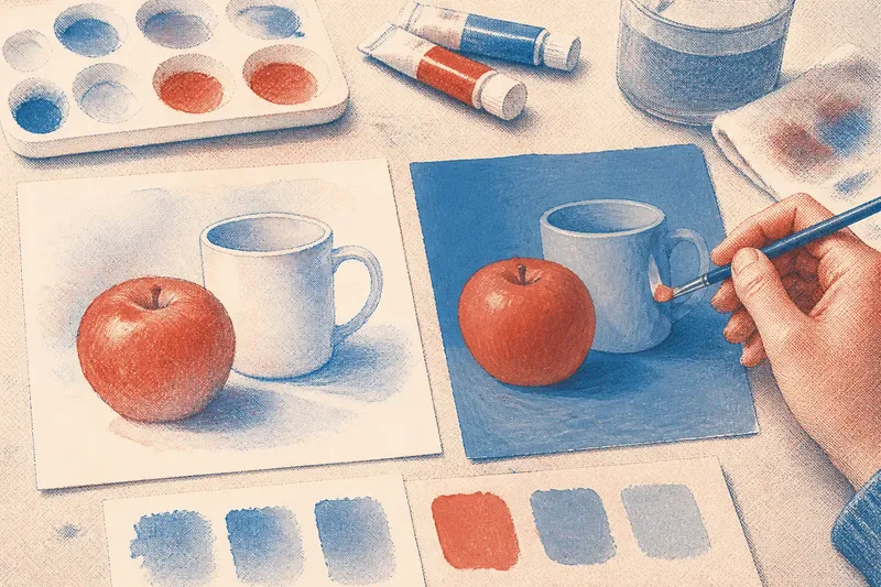
A pale blue wash dries on a scrap of paper, and the white page glows through it. Beside it, a dab of gouache dries to a flat, opaque patch. That small contrast captures the difference between watercolour or gouache: one often lets the paper contribute its light, while the other can cover the paper with a layer of its own.
If you are choosing paint for a small first study, ask whether you want light to come through the paint, whether you want to place a light color over a darker passage, and how much control you want over coverage. A few simple observations can help you select materials and a subject that suit the effect you have in mind.
Watercolour or gouache depends on where the light comes from
In transparent watercolour, a pale area often gets its brightness from the paper showing through a thin layer of pigment. The unpainted page is part of the image, not merely a background.
Gouache is generally more opaque. Its pigment and binder create a more solid-looking layer, so a painted area can conceal much of what lies beneath. This is useful when you want a matte shape or a light patch over a darker one.
These are broad tendencies, not rules for every tube or stroke. Watercolour can look dense when applied heavily, and some gouache colors are more transparent than others. As a starting point, think of watercolour as building light from visible paper and gouache as building coverage from visible paint.
That difference affects how you plan a small picture. With watercolour, reserve the brightest spots as bare paper. With gouache, you can paint those spots later, once the lower layer is dry enough to receive them without unwanted mixing.
Watercolour rewards a light touch and a plan for pale areas
Watercolour makes early decisions visible. A wash can spread beyond its intended edge, and a fresh wet stroke can disturb a layer that has not dried. Working with a few deliberate shapes makes these behaviors easier to notice.
Use watercolor paper rather than printer paper if you have it; it is made to tolerate wet paint more comfortably. A round brush, a small palette, clean water, and scrap paper for testing a wash are enough to begin. If the paper buckles or colors spread more than expected, treat that as information about the surface and water load rather than adding more paint right away.
To preserve a bright window, flower center, or stripe on a cup, leave that patch unpainted while placing the surrounding washes. Keeping a small shape white is often simpler than trying to restore it after covering it. This approach suits subjects with clear light areas and soft transitions, such as a pale fruit against a colored tabletop.
Transparent layers can shift a color without fully hiding the earlier passage. Let one wash dry before placing another over it if you want the boundary and color change to remain distinct. If the brush lifts or blends the first layer, pause and allow more drying time; repeated scrubbing may roughen the paper or make the color uneven.
Gouache makes coverage part of the composition
Gouache works well for solid blocks of color, simplified shapes, or a light detail over a darker field. Its matte surface can make a painting feel like an arrangement of shapes rather than a view through colored glass. Try it for a small study of a mug, a leaf, or colored paper.
Gouache is commonly mixed with water, but adding more water makes it less opaque. A thin application may look more like a transparent wash, while a thicker application can cover more evenly. Make a small swatch on your paper and let it dry before deciding how much coverage a particular color gives.
Gouache can dry to a different appearance than it had while wet. A test mark on the same paper lets you compare the dry color with the rest of your painting, especially when you want a pale shape to stand apart from a neighboring color.
Dry gouache can reactivate with water. A wet brush dragged across it may soften or lift the layer, which can help with blending but can also disturb a crisp edge. For a neat small painting, use a light touch over dry passages and avoid repeatedly brushing the same spot.
A small study reveals which surface you prefer
Say you have two small pieces of watercolor paper and want to paint a red apple beside a pale blue cup. On the first, use watercolour washes for the apple and leave the cup’s brightest area as bare paper. On the second, use gouache to block in both shapes, then add a light mark over a darker patch after it dries. The result to look for is whether you prefer planning around exposed paper or placing solid color over an existing layer.
Keep the subject simple so the paint, rather than drawing complexity, stays in focus. A pear, folded cloth, plant cutting, or ceramic bowl gives you useful edges and color areas without a crowded composition. Use the same paper for both versions and label each sheet before you start.
- Check that both sheets are watercolor or mixed-media paper; if they match, compare the paints on a shared surface, and if they differ, use matching sheets before drawing conclusions about the paint.
- Check whether a watercolour wash leaves the paper visible; if it does, use it for transparent effects, and if it does not, dilute the paint slightly on a fresh swatch or choose gouache for more solid coverage.
- Check whether a dry gouache swatch conceals the paper; if it does, use it for flat shapes, and if it does not, try a less diluted mix or choose a more opaque color.
- Check whether a second color disturbs the first dry layer; if the edge stays crisp, continue with layered marks, and if it softens, wait longer or use a lighter brush touch.
- Check whether the brightest area remains white in the watercolour version; if it does, keep reserving paper for highlights, and if it does not, plan a simpler shape or try adding a light gouache mark instead.
- Check whether a light gouache mark covers a darker patch; if it does, use this approach for pale details, and if it does not, test a thicker or less diluted mix before changing the composition.
- Check which dry surface has the light, edge, and texture you wanted; if one suits the subject, use that medium for the next study, and if neither does, change the water load or paper before buying more colors.
These observations are not a contest. If the watercolour version feels airy but hard to control, that may be a quality you want to explore. If gouache’s solid shapes feel satisfying, its coverage may suit your next small painting.
How do watercolour and gouache behave in common situations?
Can gouache go over watercolour?
Yes. Artists often use opaque gouache marks over a watercolour wash to add a pale detail or solid shape. Let the wash dry first and try a light stroke, since a wet brush can disturb the layer beneath.
Can watercolour go over gouache?
A transparent wash can go over dry gouache, but the gouache may reactivate when it meets water. Test the combination on scrap paper if you want the lower passage to stay crisp rather than soften or blend.
Which paint is easier for a first small painting?
It depends on which decisions feel more natural to you. Watercolour asks you to preserve light areas and work with transparency; gouache lets you cover areas more directly, while asking you to watch the water content and how dry layers respond.
Can the same brushes and paper work for both?
A brush suitable for water-based paint can usually be used with either, and watercolor paper is a sensible shared surface for a small comparison. Rinse brushes between colors and follow the paint label for product-specific handling or storage guidance.
Choose the paint that fits the mark you want
If you want light made from glowing paper, soft overlaps, and transparent color, start with watercolour. If you want matte shapes, solid coverage, and the option to add a light mark over a darker one, try gouache. A modest study can tell you more about your preferences than a large assortment chosen before you know what feels appealing.
Watercolour or gouache is ultimately a choice about the role you want the surface to play. Keep a few labeled swatches beside your painting, noting the paint and how much water you used; they give you a useful reference when a color dries differently than expected.