Why Negative Space Gives a Picture Room to Breathe
Why negative space gives a picture room to breathe: learn to spot the gaps that balance forms, guide your eye, and change how a scene feels.
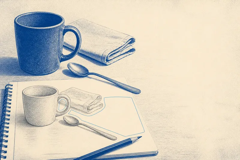
At a kitchen table, a blue mug sits near the edge of a sheet of drawing paper, with a spoon angled toward it. The empty paper around the objects seems unremarkable until you notice that the narrow gap between spoon and mug makes the arrangement feel tense, while the open area above them gives the scene a pause. That is negative space at work: the unoccupied shapes that help a picture hold together.
Why negative space gives a picture room to breathe is not a matter of leaving blank areas for their own sake. Those areas have contours, proportions, and relationships of their own. In this invented walk-through, a beginner named Mara uses a few ordinary objects to see how changing the gaps can alter balance and lead a viewer’s attention.
The arrangement begins with a crowded corner
Imagine Mara is making a small still-life drawing with a blue mug, a teaspoon, and a folded napkin. She places the mug on the left, the spoon diagonally beside it, and the napkin behind both. Her first sketch concentrates on the objects: the mug’s rim, the handle, the spoon bowl, and the napkin’s folds.
The drawing is recognizable, but the objects seem to press against one another. The spoon handle nearly touches the mug, the napkin edge sits close to the mug’s rim, and a large stretch of paper remains unused at the right. Mara has drawn each thing with care, yet the composition feels lopsided.
Instead of correcting the mug’s curve, she pauses to examine the shapes between objects. She notices a thin wedge of paper between the spoon and mug, a small enclosed gap inside the handle, and a broad opening to the right of the arrangement. These shapes are not leftover paper. They are part of what the viewer reads.
Negative space becomes easier to see as a shape
Mara lightly traces the edges of the gaps in her sketch with a pencil. The narrow wedge between spoon and mug has a sharp point; the opening inside the handle is a small oval; the broad area on the right resembles a quiet, uneven rectangle. By giving each empty area a mental outline, she can compare it with the forms around it.
This shift helps because people often name objects before they notice spatial relationships. A viewer may say “mug” and “spoon” immediately, but the distance between them also affects whether the pair feels connected, separate, or about to collide. The outline of a gap can be as distinctive as the outline of a cup.
To make this observation without drawing over the work, Mara narrows her eyes and looks at the arrangement as a collection of light and dark masses. She also glances at the paper from a little farther away. The details soften, while the larger areas and their proportions remain visible.
The first adjustment changes the balance
Say Mara shifts the spoon a little farther from the mug and turns its handle so it points toward the open right side of the page. The action widens the gap beside the mug and creates a clearer wedge of paper between the spoon and the napkin. The expected result is an arrangement whose parts read as related but no longer crowded together.
She then moves the group slightly away from the left edge in the drawing. This reduces the large empty area on the right without filling it entirely. The page feels less weighted to one side, and the spoon’s direction gives the eye a route from the mug toward the remaining open paper.
Notice that the change is not simply “more space is better.” If Mara separated every object by the same generous distance, the still life might lose its sense of connection. The useful question is whether each gap supports the kind of relationship she wants: closeness, pause, contrast, or direction.
Small gaps can carry strong visual pressure
The space inside the mug handle is small, but it matters because its outline echoes the handle’s curve. If Mara draws that opening too wide, the handle may look thin; if she makes it too narrow, the mug can appear heavy or cramped. The empty shape helps define the solid form around it.
The narrow space between spoon and mug also has a different effect from the large area beside the objects. A tight gap can create a feeling of pressure or near-contact. A broad gap often gives the eye a place to rest, though its effect depends on where it sits and how the neighboring forms are shaped.
Mara checks these relationships by looking at the gaps rather than measuring them. She asks whether a space narrows, widens, or changes direction, and whether that shape seems consistent with the edges that contain it. This kind of comparison is useful in a quick sketch, a collage, or a photograph; no special equipment is needed.
Direction and contrast guide the viewer’s attention
With the spoon angled toward the open side, the eye tends to follow its long handle. The empty space ahead of the handle gives that direction somewhere to go. If the spoon pointed toward the page edge instead, the viewer might feel that its movement is cut off, a different effect Mara could choose deliberately.
Contrast also changes how a gap reads. A pale area surrounded by dark forms may stand out clearly, while a similar area against a pale background can be less noticeable. In a drawing, Mara can watch how the outline of a gap appears against the paper; in a photograph, she can pay attention to the boundary between a subject and its background.
She now wants the mug to remain the main focus, so she leaves a little more breathing room around its handle and rim than around the spoon’s bowl. The spacing gives the mug’s silhouette a clean edge, while the spoon remains close enough to feel connected. The expected observable result is that the mug attracts attention first, then the spoon leads the eye outward.
A short set of questions helps Mara revise
How can I tell which space feels crowded?
Look for a gap that pinches into a sharp sliver or nearly disappears where two forms meet. Compare it with nearby openings: if one feels much tighter, ask whether that pressure is intentional or distracting.
Should every object have equal room around it?
No. Even spacing can make a composition feel orderly, but it can also flatten relationships that might be more interesting when varied. Choose spacing according to what should feel connected, prominent, or separate.
Can I study negative space in a finished picture?
Yes. Trace the edges of the open shapes with your eyes, including spaces between limbs in a figure, openings in architecture, or gaps among leaves. Notice which shape seems to hold your attention and where its boundaries lead.
What if the empty area looks like a mistake?
Check whether it balances the other forms, supports their direction, or provides a deliberate pause. If it does none of those things, shifting a form or changing its angle may help the area feel more connected to the picture.
The finished sketch keeps one useful pause
Mara’s revised drawing still contains the same mug, spoon, and napkin. What changed is the pattern of intervals: the handle opening is clear, the spoon no longer crowds the mug, and the empty area on the right is smaller but still present. The drawing feels steadier because the open shapes now have a more deliberate relationship to the objects.
For a viewer, this offers a simple way to look: follow an object’s edge, then notice the shape that edge makes with its neighbor. Negative space gives a picture room to breathe when those spaces are treated as active parts of the composition, not as gaps waiting to be filled. Next time a picture feels crowded or oddly unbalanced, let your attention rest on one empty shape and see where its outline takes you.